In a world where smartphones and tablets are as common as coffee cups in a Melbourne café, having a website that looks great and functions seamlessly on every device is no longer optional—it’s essential. Enter responsive design, the unsung hero of modern web development. But what exactly is responsive design, and why should Australian businesses care? Let’s break it down.
Contents
ToggleWhat Is Responsive Design?
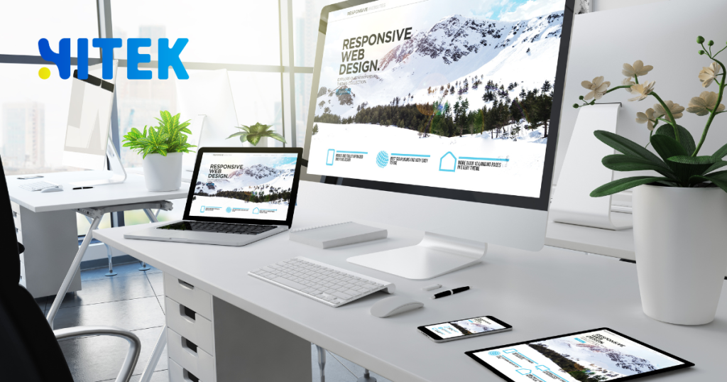
Responsive design is a web development approach that ensures a website adapts to the screen size and orientation of the device it’s being viewed on. Whether your audience is scrolling on a smartphone, browsing on a tablet, or clicking through on a desktop, a responsive website delivers an optimal viewing experience.
Think of it like a chameleon. A responsive website changes its layout, images, and even navigation to fit the device, ensuring users don’t have to pinch, zoom, or squint to read your content. This adaptability is achieved through flexible grids, fluid images, and CSS media queries.
Why Responsive Design Matters for Australian Businesses
Australia is a mobile-first nation. According to Statista, over 80% of Australians own a smartphone, and many rely on these devices to browse the web. If your website isn’t mobile-friendly, you’re frustrating potential customers and missing out on valuable traffic and conversions.
Here’s why responsive design is a game-changer for Australian businesses:
- Improved User Experience: A responsive website ensures visitors can easily navigate your site, no matter the device. This leads to longer visit durations and lower bounce rates.
- SEO Benefits: Google prioritizes mobile-friendly websites in its search rankings. A responsive design can boost your visibility on search engines, helping you attract more local customers.
- Cost Efficiency: Instead of maintaining separate websites for desktop and mobile users, a responsive design consolidates everything into one site, saving time and money.
- Future-Proofing: As new devices with varying screen sizes hit the market, a responsive website will continue to perform well without requiring constant updates.
Key Elements of Responsive Design
To understand how responsive design works, let’s look at its core components:
1. Fluid Grids
Traditional web layouts use fixed-width designs, which can look awkward on smaller screens. Fluid grids, on the other hand, use relative units like percentages instead of pixels, allowing elements to resize proportionally.
2. Flexible Images
Images are a crucial part of any website, but they can break a layout if not appropriately handled. Responsive design uses CSS to ensure images scale within their containing elements, preventing them from overflowing or appearing too small.
3. Media Queries
Media queries are a CSS feature that allows developers to apply different styles based on the device’s characteristics, such as screen width, resolution, or orientation. For example, a media query might adjust the font size for smartphones or hide certain elements on smaller screens.
Responsive Design in Action: A Case Study
Let’s look at how responsive design has transformed the online presence of an Australian business. The Iconic, one of Australia’s leading online fashion retailers, uses responsive design to deliver a seamless shopping experience across devices.
On the desktop, the site features a multi-column layout with large images and detailed product descriptions. On mobile, the layout shifts to a single column, with simplified navigation and touch-friendly buttons. This adaptability has helped The Iconic maintain its position as a top player in the competitive e-commerce space.
Common Responsive Design Mistakes to Avoid
While responsive design offers numerous benefits, it’s not without its challenges. Here are some common pitfalls to watch out for:
- Ignoring Performance: A responsive website that loads slowly on mobile devices can frustrate users. Optimize images and minimize code to ensure fast load times.
- Overlooking Touchscreen Functionality: Buttons and links should be large enough to tap easily on touchscreens.
- Neglecting Testing: Always test your website on multiple devices and browsers to ensure consistency.
How to Implement Responsive Design for Your Australian Website
Ready to make your website responsive? Here’s a step-by-step guide:
- Audit Your Current Site: Use tools like Google’s Mobile-Friendly Test to identify areas for improvement.
- Choose a Responsive Framework: Platforms like Bootstrap and Foundation offer pre-built responsive templates to streamline development.
- Optimize Content: Prioritize essential content for mobile users and ensure it’s easy to read and navigate.
- Test Thoroughly: Check your site on various devices and screen sizes to ensure a consistent experience.
Responsive Design vs. Mobile Apps: Which Is Better?
While responsive design is ideal for most websites, some businesses may wonder if a mobile app is a better option. Here’s a quick comparison:
| Feature | Responsive Design | Mobile App |
|---|---|---|
| Cost | Lower upfront and maintenance costs | Higher development and upkeep costs |
| Accessibility | Accessible via any browser | Requires download and installation |
| User Experience | Consistent across devices | Can offer more advanced features |
| SEO Benefits | Improves search rankings | Limited SEO impact |
For most Australian businesses, responsive design strikes the perfect balance between functionality and affordability.
The Future of Responsive Design
As technology evolves, so does responsive design. Emerging trends like progressive web apps (PWAs) and AI-driven personalization are pushing the boundaries of what’s possible, offering even more tailored experiences for users.
For Australian businesses, staying ahead of these trends is crucial. By investing in responsive design today, you’re not just meeting current user expectations—you’re preparing for the future.
Final Thoughts
Responsive design isn’t just a technical buzzword; it’s a necessity in today’s digital landscape. For Australian businesses, it’s an opportunity to connect with customers on their terms, no matter where or how they browse.
So, is your website ready to adapt? If not, now’s the time to embrace responsive design and ensure your online presence is as dynamic as your audience.
Ready to transform your website? Contact a trusted Australian web development agency today and take the first step toward a responsive, user-friendly site.
By focusing on responsive design, Australian businesses can create websites that look stunning and perform brilliantly across all devices. It’s not just about keeping up with the times—it’s about staying ahead of the curve.


